The purpose of this post is to illustrate and analyze the use of the following design principles: contrast, repetition, alignment, proximity, and color. An advertisement from the company Fullstop is being used in the analysis, the name of which is “Your pride is ours”. Fullstop is a company that offers advertising, branding, and public relations services. The exact designer of this ad could not be identified.
Link: https://www.adsoftheworld.com/media/digital/mobily_your_pride_is_ours
Contrast

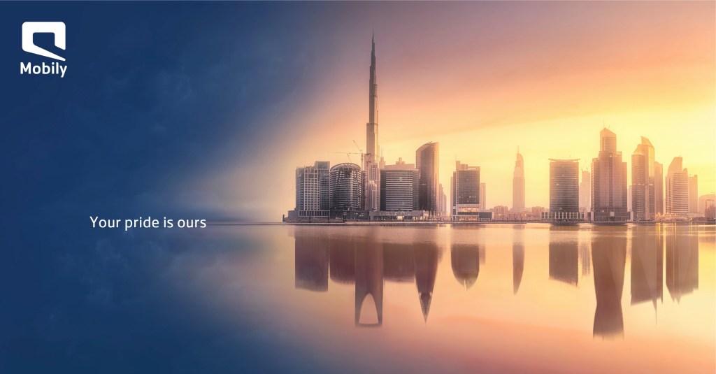
Contrast is created in this ad mainly by the color contrast from dark blue to lighter orange and yellow tones. This draws the eye to the brighter part of the image and the skyline as well. There is also contrast between the white text and its darker background. It makes the text easier to read than if it had the same light yellow and orange background as the skyline, where it could easily get lost, and attracts the viewer to the text.
Repetition
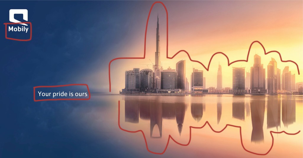
Repetition is used in a couple of different ways. First, the font and color of the text and the logo is consistent. Second, repetition is shown in the reflection of the skyline. This really emphasizes the buildings and their significance in the advertisement in showing the top skyline of Dubai, UAE and the reflected skyline of Riyadh, the capital of Saudi Arabia.
Alignment

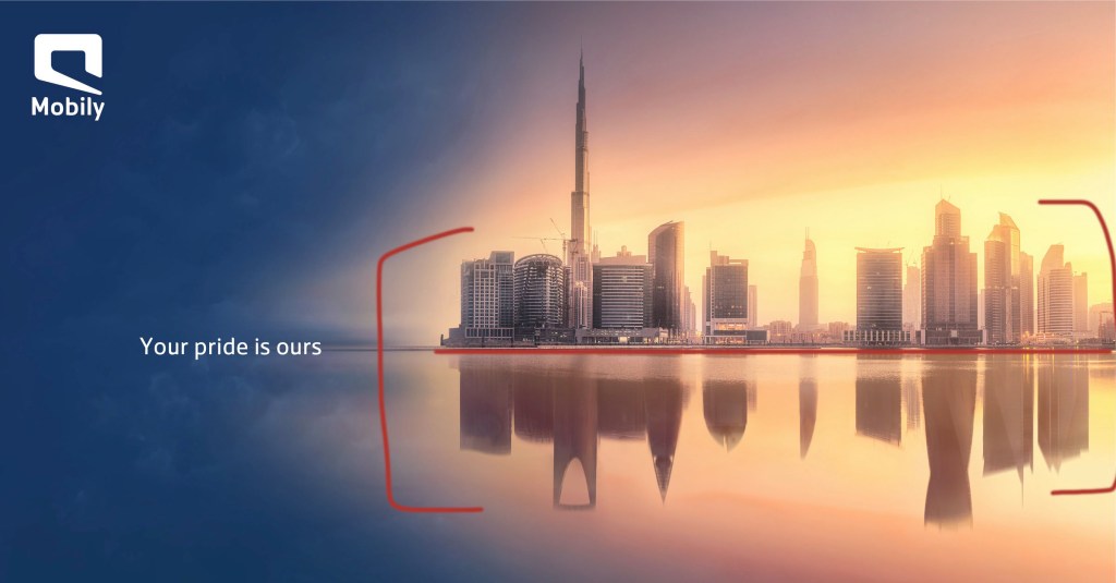
Alignment plays a big role in this advertisement by being able to draw the eye to the text “Your pride is ours” instead of getting lost in the brightness of the skyline and reflection. Since the text is aligned with the reflection point of the skyline, the eye is naturally drawn to that point.
Proximity
The proximity of the two skylines, which share an edge, signifies that the two places are connected in some way. The advertisement is trying to relay a sense of unity between the two countries using the touching skylines of their most famous cities.
Color

There is a huge color contrast in this ad that really makes the skylines stand out to the viewer. It is clear that this is the focus of the ad, as the brightest yellow color is closest to the buildings, and gradually fades into a slightly darker orange and eventually into a dark blue. It gives the effect of a sunrise, but rather than equally distributing the color of the sunrise, it is focused on the area they want to draw the eye to.
Conclusion
In this Fullstop advertisement, each of these elements of design plays an important role in drawing the viewer’s eye to the right places for them to understand what the ad is conveying and therefore making it an effective advertisement. Overall, the viewer’s eye is drawn to the ad as well because it is beautiful, and there are a few layers to dissect when it comes to noticing the skylines of different cities and the unity that is meant to represent as well.
