Introduction
This advertisement comes from a bookstore called Mint Vinetu. The creative director of this ad was Tomas Ramanauskas, and more information about credits can be found here.
Original Ad Analysis

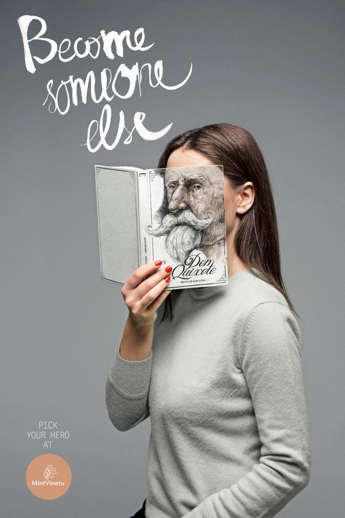
This advertisement uses the design principle of contrast by keeping the advertisement void of bright colors, but having the woman’s fingernails painted red to contrast that. This draws the eye to her hand, which consequently draws the eye to the book she is holding, which is the focus of the advertisement.
Repetition is used by using gray as the background color, the color of the book cover, and for the color of the woman’s sweater.
Clearly the face on the book aligns perfectly with the woman’s face, creating the illusion of them being the same object. The image of the woman is focused more to the right to allow for balance of the text and logo on the left side.
Proximity is used as the eyes carry through the top text and down to the woman and the book she is holding. Those things are related to each other, and so they are physically close in the ad.

The careful consideration of color in this ad gives an effect that whoever is looking at the add is meant to use their imagination. It almost provides a blank slate for dreaming. The only color is the red on the woman’s nails, which draws the eye to the book she is holding, which is the focus of the ad.
The script font at the top of the page gives a whimsical feeling to the ad, which matches with the message of being able to imagine yourself as someone else. Then, the font at the bottom of the page and in the logo are simple to let the focus be on that top, scripted font.
New Ad Analysis
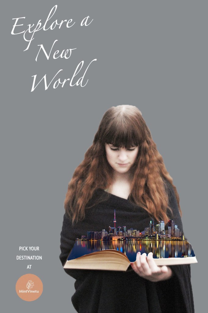
This is my version of the ad above. I went with the theme of the power books can have on our imagination, while focusing on being in a different place rather than becoming a different person.
My advertisement uses the design principle of contrast by keeping the advertisement void of bright colors, but having the image coming out of the book colorful to contrast that. This draws the eye to this area of the ad, which is the focus of the advertisement.
Repetition is used in my ad by keeping all text a white color, and keeping the woman’s dress and the background in the black-gray range.
Just as in the original, the image of the woman is aligned more to the right to allow for balance of the text and logo on the left side.
Proximity is used as the eyes carry through the top text and down to the woman and the book she is holding. Those things are related to each other, and so they are physically close in the ad. This is the same design technique as used in the original advertisement.
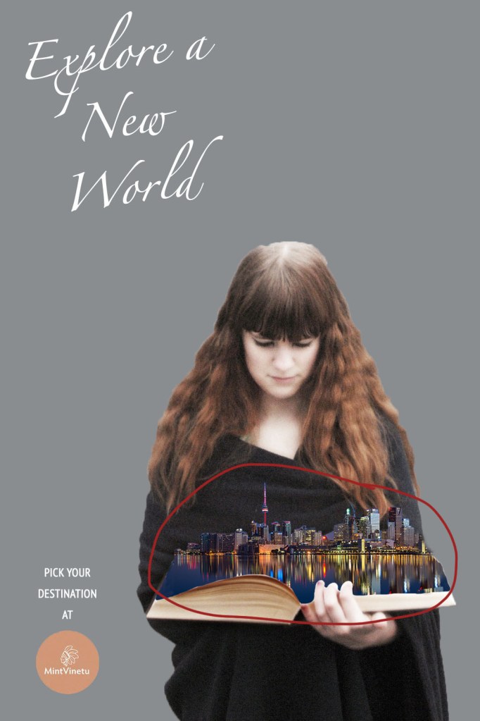
I stuck with very minimal color except around the book. Just like in the original, leaving most of the ad void of color draws the eye to the most important part, which is the book.

Going along with the original ad, I kept a scripted font at the top describing the purpose of the ad. Again, it adds a whimsical feel to the overall advertisement, and the text is large and noticeable. For the bottom text and logo, I kept it simple just at the original did to not draw the focus to it too much.
Conclusion
In conclusion, both of these advertisements are effective in conveying the message that books have the power to tap into your creativity and imagination, whether it be by imagining yourself in a character’s shoes, or transporting to a whole other world. Both have a very simple and clean design that is effective at drawing the eye to the focus of the ad, which is the book in both cases. They work together for the same campaign because they are emphasizing the magic of books.
