Be yourself; Everyone else is already taken.
— Oscar Wilde.
This is the first post on my new blog. I’m just getting this new blog going, so stay tuned for more. Subscribe below to get notified when I post new updates.
Be yourself; Everyone else is already taken.
— Oscar Wilde.
This is the first post on my new blog. I’m just getting this new blog going, so stay tuned for more. Subscribe below to get notified when I post new updates.
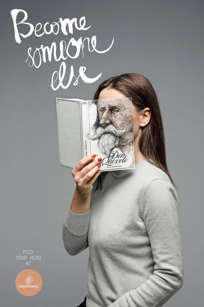
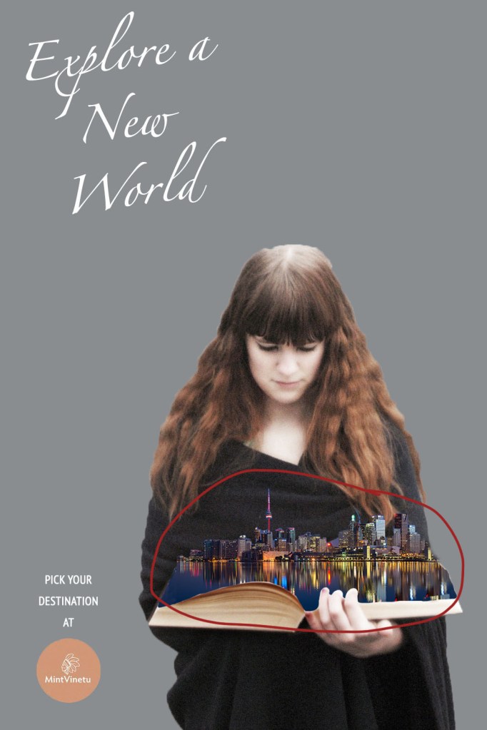
This advertisement comes from a bookstore called Mint Vinetu. The creative director of this ad was Tomas Ramanauskas, and more information about credits can be found here.

This advertisement uses the design principle of contrast by keeping the advertisement void of bright colors, but having the woman’s fingernails painted red to contrast that. This draws the eye to her hand, which consequently draws the eye to the book she is holding, which is the focus of the advertisement.
Repetition is used by using gray as the background color, the color of the book cover, and for the color of the woman’s sweater.
Clearly the face on the book aligns perfectly with the woman’s face, creating the illusion of them being the same object. The image of the woman is focused more to the right to allow for balance of the text and logo on the left side.
Proximity is used as the eyes carry through the top text and down to the woman and the book she is holding. Those things are related to each other, and so they are physically close in the ad.

The careful consideration of color in this ad gives an effect that whoever is looking at the add is meant to use their imagination. It almost provides a blank slate for dreaming. The only color is the red on the woman’s nails, which draws the eye to the book she is holding, which is the focus of the ad.
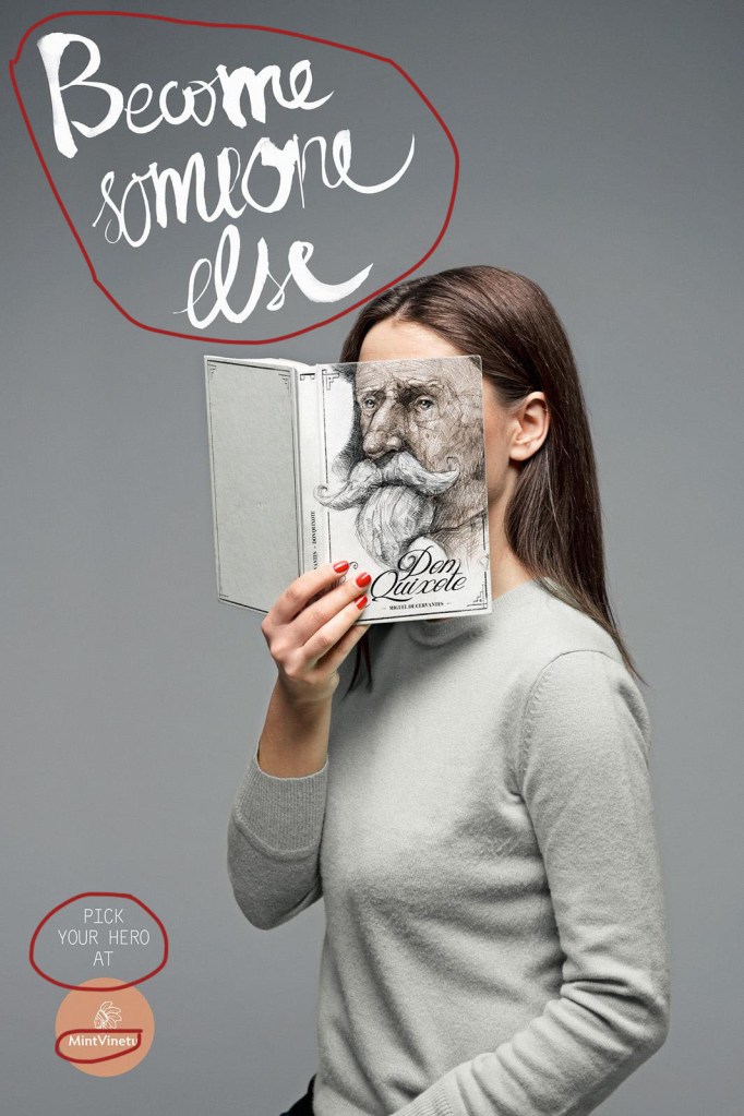
The script font at the top of the page gives a whimsical feeling to the ad, which matches with the message of being able to imagine yourself as someone else. Then, the font at the bottom of the page and in the logo are simple to let the focus be on that top, scripted font.
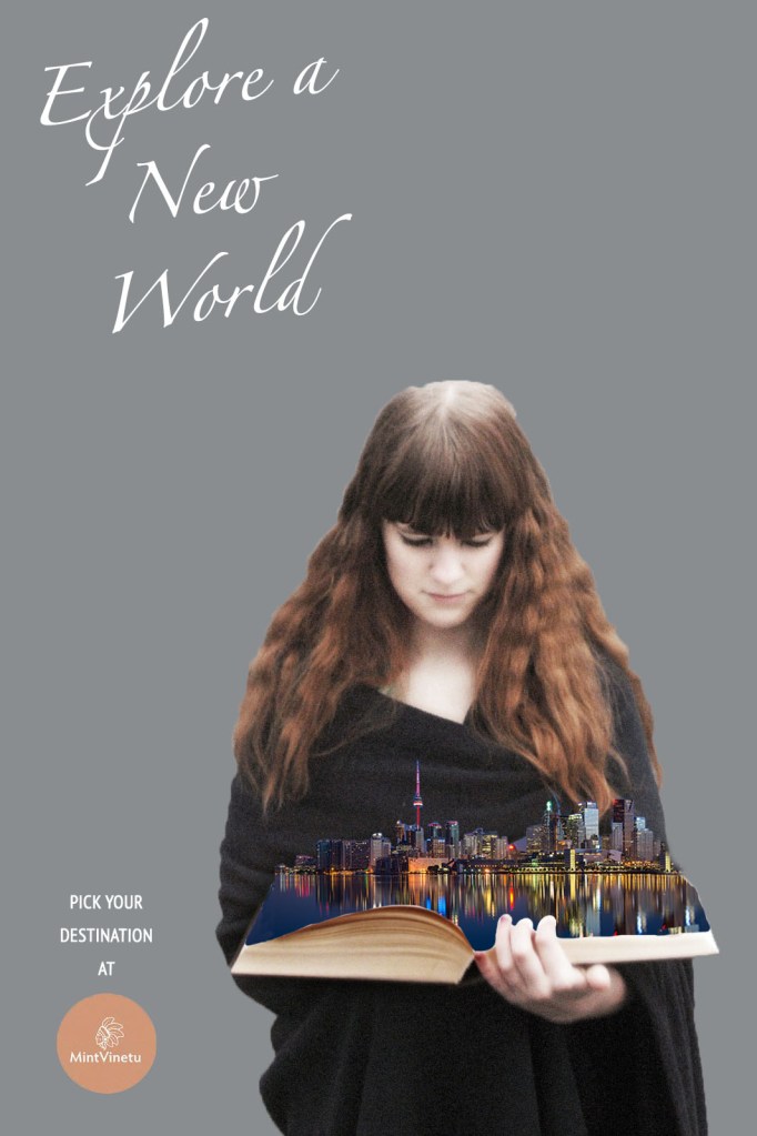
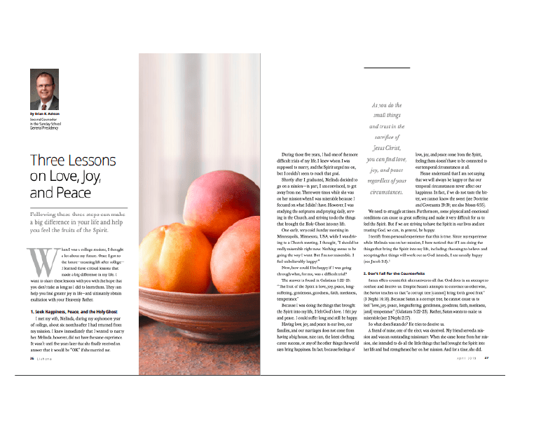
This is my version of the ad above. I went with the theme of the power books can have on our imagination, while focusing on being in a different place rather than becoming a different person.
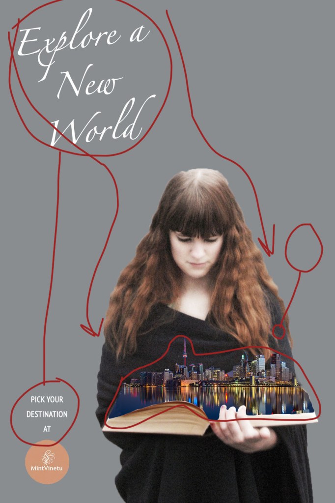
My advertisement uses the design principle of contrast by keeping the advertisement void of bright colors, but having the image coming out of the book colorful to contrast that. This draws the eye to this area of the ad, which is the focus of the advertisement.
Repetition is used in my ad by keeping all text a white color, and keeping the woman’s dress and the background in the black-gray range.
Just as in the original, the image of the woman is aligned more to the right to allow for balance of the text and logo on the left side.
Proximity is used as the eyes carry through the top text and down to the woman and the book she is holding. Those things are related to each other, and so they are physically close in the ad. This is the same design technique as used in the original advertisement.
I stuck with very minimal color except around the book. Just like in the original, leaving most of the ad void of color draws the eye to the most important part, which is the book.

Going along with the original ad, I kept a scripted font at the top describing the purpose of the ad. Again, it adds a whimsical feel to the overall advertisement, and the text is large and noticeable. For the bottom text and logo, I kept it simple just at the original did to not draw the focus to it too much.
In conclusion, both of these advertisements are effective in conveying the message that books have the power to tap into your creativity and imagination, whether it be by imagining yourself in a character’s shoes, or transporting to a whole other world. Both have a very simple and clean design that is effective at drawing the eye to the focus of the ad, which is the book in both cases. They work together for the same campaign because they are emphasizing the magic of books.
This magazine spread comes from the April 2019 Liahona magazine. The specific photograph did not have any attribution in the magazine, but it assumed that the image is owned by the Church of Jesus Christ of Latter-day Saints, to whom the magazine also belongs.
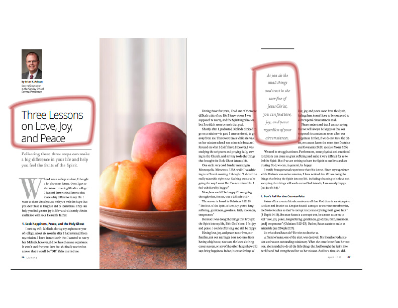
The font circled on the first page would be classified as a sans serif font. This font is easily identified because of the lack of strokes or serifs on the letters. The font circled on the second page would be classified as an old style serif font because there is not much different between the weight of the strokes and some letters have a serif.
The typeface of the two fonts contrast because one is a serif font and the other is sans serif. The other difference between them is the fact that the font on the second page is in italics, so it contrasts even more heavily with the normal font on the first page.

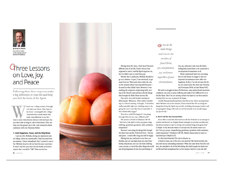
The photography on this magazine page implements the Rule of Thirds. As illustrated by the lines drawn in the image above, the bowl of fruit is not perfectly centered in the image. Rather, it takes up about two-thirds of the height of the image, leaving the top third blank.
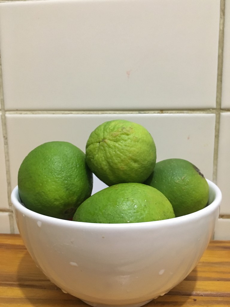
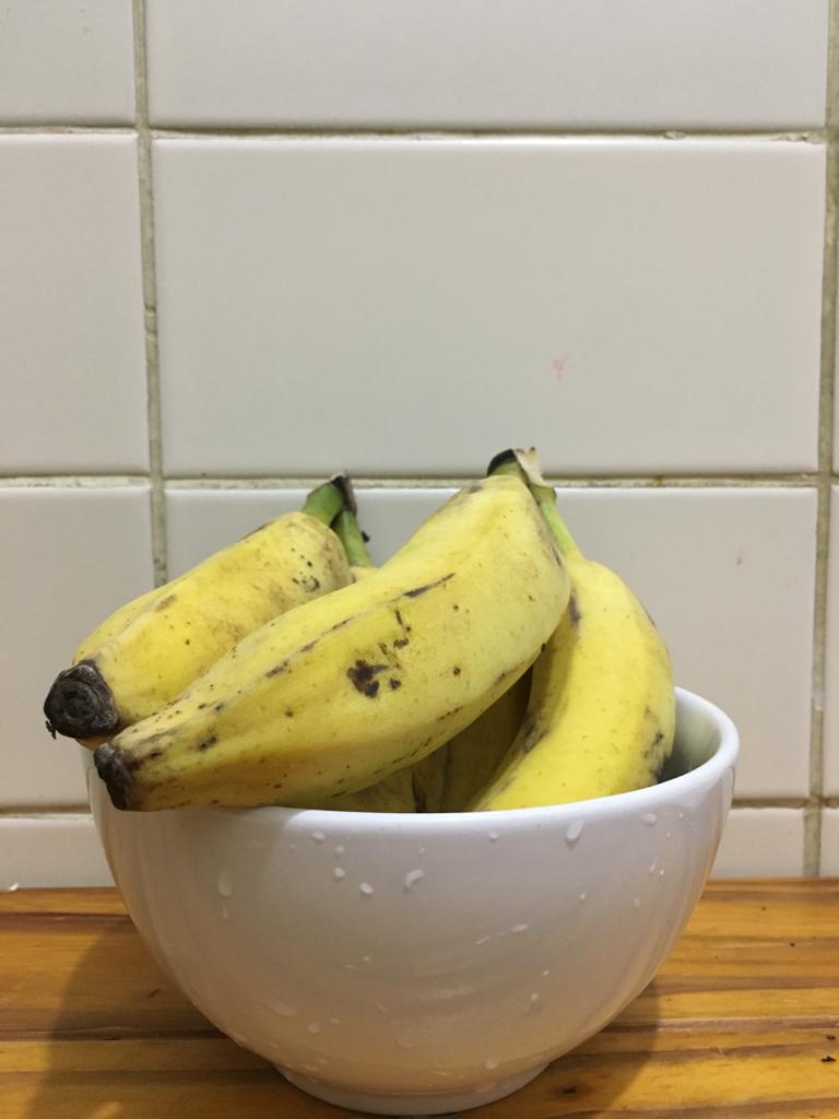
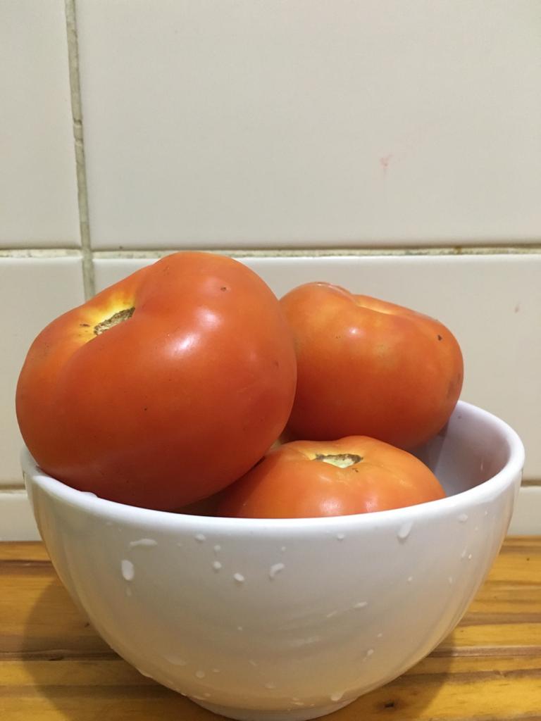
I mimicked the original photo in the magazine by also utilizing the rule of thirds. In order to make the image still fit with the theme of the original, I used only fruits and vegetables in a bowl in my images. Because the article is related to “fruits of the spirit”, any fruit or related item such as a vegetable will still make sense when placed as a photo next to the article.
Both the contrast in typeface and the Rule of Thirds greatly enhance the overall design of this magazine cover. The two typefaces draw your eyes to those highlighted titles and quotes while making the article appear more interesting to the eye at first glance. The photograph of fruit that implements the Rule of Thirds provides an interesting image to illustrate a part of the topic of the article. Overall, both these principles were implemented well in this magazine.
The purpose of this post is to illustrate and analyze the use of the following design principles: contrast, repetition, alignment, proximity, and color. An advertisement from the company Fullstop is being used in the analysis, the name of which is “Your pride is ours”. Fullstop is a company that offers advertising, branding, and public relations services. The exact designer of this ad could not be identified.

Link: https://www.adsoftheworld.com/media/digital/mobily_your_pride_is_ours

Contrast is created in this ad mainly by the color contrast from dark blue to lighter orange and yellow tones. This draws the eye to the brighter part of the image and the skyline as well. There is also contrast between the white text and its darker background. It makes the text easier to read than if it had the same light yellow and orange background as the skyline, where it could easily get lost, and attracts the viewer to the text.
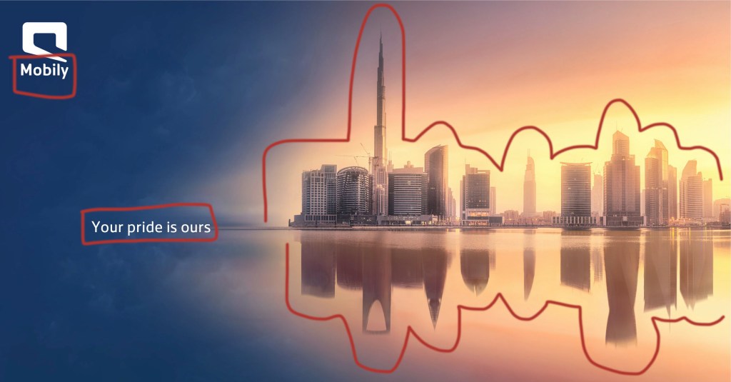
Repetition is used in a couple of different ways. First, the font and color of the text and the logo is consistent. Second, repetition is shown in the reflection of the skyline. This really emphasizes the buildings and their significance in the advertisement in showing the top skyline of Dubai, UAE and the reflected skyline of Riyadh, the capital of Saudi Arabia.

Alignment plays a big role in this advertisement by being able to draw the eye to the text “Your pride is ours” instead of getting lost in the brightness of the skyline and reflection. Since the text is aligned with the reflection point of the skyline, the eye is naturally drawn to that point.
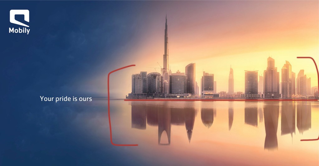
The proximity of the two skylines, which share an edge, signifies that the two places are connected in some way. The advertisement is trying to relay a sense of unity between the two countries using the touching skylines of their most famous cities.

There is a huge color contrast in this ad that really makes the skylines stand out to the viewer. It is clear that this is the focus of the ad, as the brightest yellow color is closest to the buildings, and gradually fades into a slightly darker orange and eventually into a dark blue. It gives the effect of a sunrise, but rather than equally distributing the color of the sunrise, it is focused on the area they want to draw the eye to.
In this Fullstop advertisement, each of these elements of design plays an important role in drawing the viewer’s eye to the right places for them to understand what the ad is conveying and therefore making it an effective advertisement. Overall, the viewer’s eye is drawn to the ad as well because it is beautiful, and there are a few layers to dissect when it comes to noticing the skylines of different cities and the unity that is meant to represent as well.
This is an example post, originally published as part of Blogging University. Enroll in one of our ten programs, and start your blog right.
You’re going to publish a post today. Don’t worry about how your blog looks. Don’t worry if you haven’t given it a name yet, or you’re feeling overwhelmed. Just click the “New Post” button, and tell us why you’re here.
Why do this?
The post can be short or long, a personal intro to your life or a bloggy mission statement, a manifesto for the future or a simple outline of your the types of things you hope to publish.
To help you get started, here are a few questions:
You’re not locked into any of this; one of the wonderful things about blogs is how they constantly evolve as we learn, grow, and interact with one another — but it’s good to know where and why you started, and articulating your goals may just give you a few other post ideas.
Can’t think how to get started? Just write the first thing that pops into your head. Anne Lamott, author of a book on writing we love, says that you need to give yourself permission to write a “crappy first draft”. Anne makes a great point — just start writing, and worry about editing it later.
When you’re ready to publish, give your post three to five tags that describe your blog’s focus — writing, photography, fiction, parenting, food, cars, movies, sports, whatever. These tags will help others who care about your topics find you in the Reader. Make sure one of the tags is “zerotohero,” so other new bloggers can find you, too.
